The flexibility of grid systems allows for various permutations of column sizes. In this post I'm going to briefly discuss four basic grid systems - the "traditional" 960 grid system, two 970 grid systems using 12 columns and a 970 grid system derived from the Golden Ratio.
Before we start it's probably worth mentioning that the current trend of desktop/laptop website widths are based on the majority of viewers screen size which at the moment sits at around 1000 pixels (I remember when we designed sites with a max width of 800px). Check out my previous post what is your average viewers screen size and follow the googlelabs link for the current assessment of the situation.
The 960 grid is based on a page width of 960 pixels that consists of 12 columns. Each column is 80px wide - made up of a content area of 60px with a 10px margin on the left and right. 12 is the magik number as it can be divided by 2, 3, 4 & 6 so there is a great range of potential column widths to choose.

Benefits of the 960 grid is in easy multiplication (3x80 can be done without a calculator at 8:00am before a coffee).
Opponents of the 960 grid point to the margins - two columns each with a 10px margin will generate a 20px gutter (the bit between two columns), too big they say. Also the page edges will only have a 10px margin while the gutter is twice as big at 20px.
The 970 grid - here are two versions that use 12 columns and one that is derived from the Golden Ratio:
- 970 - 70 grid system
- 970 - 68 grid system
- 970 - golden ratio grid
The 970 - 70 grid system has 70 pixel content columns with a left margin of 10 pixels and no right margin - apart from the last column which has a 10px right margin. The benefits are smaller, equal sized gutters and larger content columns.

The 970 - 68 grid system has 68 pixel content columns with the gutter between each column of 14 pixels (there are only 11 gutters). There is no margin on the far left or far right column. The benefits are a grid that has content columns that go right to the edge, but still easily divisible.

The 970 - golden ratio grid does not use the 12 column format. Instead it is based on the Golden Ratio that uses grid sizes that are "beautifully" in proportion to each other.

The overall width of 970 is subdivided into various columns of 600, 370, 230, 140, 90 & 50 pixels with a proportional padding size of 13 pixels (20px is also a proportional number!).
Although slightly more complex to use, it covers the basic building blocks for column widths however for multiple columns of the same width (eg. you want 4 equal sized columns) then your best choice is one of the above grid systems.

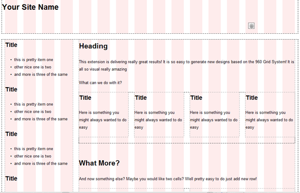
If you want to generate some HTML and CSS with a built in grid system - check out www.gridsystemgenerator.com this is great for fast mock-ups in HTML.
For more detail about designing with grid systems check out the previous web devil post about grid systems for web design.
View comments